Wednesday, 28 March 2012

Triggers in WPF

Well ,i decided to write some thing about triggers  that we have in WPF.
Triggers:
Triggers define set of styles that work on certain condition.These set of styles are applied to the controls when the condition is met.
We do have 3 types of Triggers in WPF
1.Property Triggers.
2.Data Triggers.
3.Event Triggers.
Property Triggers:
      These triggers are fired when the value of the dependency property changes.
Actions:
1.Setter elements set values for one or more dependency properties.
2.One or more trigger action classes fire,when the trigger becomes active or inactive.
Data Triggers:
      These triggers are fired when the value of the CLR (common language runtime) property changes.It specifies property using Binding keyword.
Actions:
1.Setter elements set values for one or more CLR properties.
2.One or more trigger action classes fire,when the trigger becomes active or inactive.
Event Triggers:
      These triggers are fired when the routed event is fired.
Actions:
1.Class that derives from trigger action fires.
  Ex: BeginStoryBoard or SoundPlayerAction 
2.Often used for animations.
 This is about triggers that we have in WPF.
Tuesday, 27 March 2012

Animation based on property of the control

This article is about sample animation of a button with the properties of height and width.Here it is the sample animation that we can apply on any controls based on their own properties.
Here i'm animating the button when the button is loaded.Simply i'm increasing the height and width using story board tags.
To work with story board , we have to mention the target name i.e. on which control we are applying the animation, time duration and target property i.e. based on which property we are animating the control.
Code :

<Button Content="Click Me" Height="25" HorizontalAlignment="Left" Margin="25,25,0,0" Name="button1" VerticalAlignment="Top" Width="100" >
            <Button.Triggers>
                <EventTrigger RoutedEvent="Button.Loaded">
                    <BeginStoryboard>
                        <Storyboard>
                            <DoubleAnimation
                        Storyboard.TargetName="button1" Storyboard.TargetProperty="Width"
                        From="100" To="135" Duration="0:0:0.2" AutoReverse="True" RepeatBehavior="Forever"/>
                            <DoubleAnimation Storyboard.TargetName="button1" Storyboard.TargetProperty="Height"
                        From="25" To="60" Duration="0:0:0.3" AutoReverse="True" RepeatBehavior="Forever"/>
                        </Storyboard>
                    </BeginStoryboard>
                </EventTrigger>
            </Button.Triggers>
</Button>
Here RepeatBehavior is set to Forever that means, the animation can be performed till we close the window/page( what ever we used).

This is the sample code to animate a button based on the properties of height and width.
Hope you understand this article..

Thursday, 22 March 2012

Binding Collection to the DataGrid.

Hi .. This article is about binding the collection of data to the controls that display in a format like Table or list and etc..
It took so much time for me to understand the things behind binding the data using collections.So, i'm sharing my snippets for reference.
First of all, i have taken a Datagrid control .You can drag it from the ToolBox to bind the data.
<DataGrid Height="100" AutoGenerateColumns="False"HorizontalAlignment="Left" Margin="10,10,10,10" Name="dataGrid1" VerticalAlignment="Top" Width="200"/> 
After that i have created my collection of items to bind to the control in the MainWindow.cs page.Here, the list looks like,
public class Author
  {
    public int ID { get; set; }
    public string Name { get; set; }    
   }
private List<Author> LoadCollectionData()
  {
   List<Author> authors = new List<Author>();
      authors.Add(new Author(){ID = 101,Name = "Darren"});
      authors.Add(new Author(){ID = 201,Name = "Kathy"});
      authors.Add(new Author(){ID = 301,Name = "AJ"});
 return authors;
}
Now we have to bind these collection to the DataGrid that we have placed in our MainWindow.XAML.
For this we have to add the XML namespace assembly of the current project to make available of all the properties and methods to the controls that we work with.
I have added this as,
xmlns:loc="clr-namespace:ClassListBind"
Now we have to call the method of the list<Author> that we have created in the resources to make it available to the controls.
 <Window.Resources>
  <ObjectDataProvider x:Key="MyData" ObjectType="{x:Type      loc:DatatList}" MethodName="LoadCollectionData"/>                
</Window.Resources>
Here i have assigned a name for this to call where ever i need.And, i have added two columns to the datagrid to bind the data as needed.
After this i have called this static resource in the datagrid control's item source like this.
<DataGrid Height="100" AutoGenerateColumns="False" ItemsSource="{Binding Source={StaticResource MyData}}" HorizontalAlignment="Left" Margin="7,9,0,0" Name="dataGrid1" VerticalAlignment="Top" Width="200">
  <DataGrid.Columns>
   <DataGridTextColumn Binding="{Binding Name}" Header="Name"/>
   <DataGridTextColumn Binding="{Binding ID}" Header="ID"/>
  </DataGrid.Columns>
</DataGrid>

Like this we have to bind the collection of items to the controls to display as we needed.
This is the article about binding. 
Hope you understand ..!!

Wednesday, 14 March 2012

Classes and Namespaces In WPF

Creating new project with WPF,loads some namespaces and classes by default.Before working with those, we must know about those, that we use in our applications.
Before going to the classes and namespaces , we must know about the assemblies that provide classes and interfaces.


Assemblies of WPF:
WPF have three base assemblies. Those are as follows.
1. WindowsBase.dll : Defines the base infrastructure of WPF , including dependency properties.
2.PresentationCore.dll : Defines numerous types that constitute the foundation of the WPF GUI(graphical user interface) layer.
3.PresentationFoundation.dll : Defines WPF control types,animations and multimedia ,data binding support .It also specifies some other functionality.
The above three are managed libraries.Besides these WPF uses an unmanaged libraryi.e. milcore.dll. This library is responsible to work with DirectX Layer.Means, this library acts as a bridge between WPF managed libraries and DirectX Layer.


Classes of WPF:
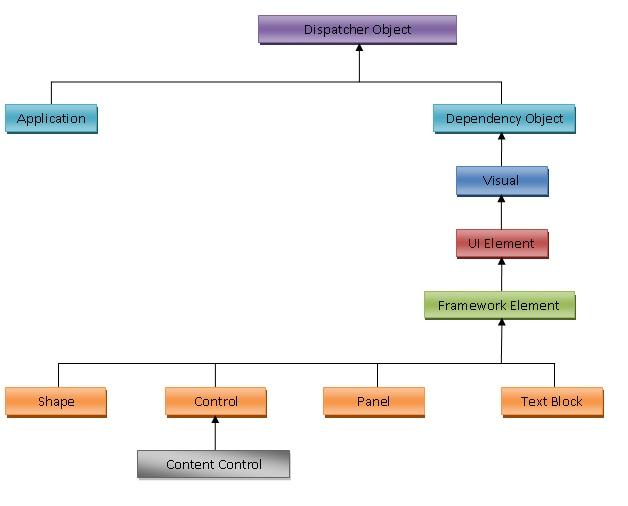
Have a look at the below figure for class's functionality.
WPF Class Diagram
All the above assemblies provides a number of new namespaces and hundreds of new .NET types(classes, interfaces, structures, enumerations and delegates) to work with WPF. 


Dispatcher Object:It is an abstract base class for classes that are bound to one thread. Classes that are derived from Dispatcher Object have an associated Dispatcher object that can be used to switch the threads.
Application:In every WPF application, one instance of Application class is created. This class implements a singleton pattern for access to the window of application, resources and properties.
Dependency Object:It is the base class for all the classes that supports Dependency property. 
Visual:This is the base class for all the visual elements of WPF. It also includes features of transformation.
UI Element:It is the abstract base class for all WPF elements that need basic presentation feature. This class provides events such as mouse over, drag and drop, click, etc.
Framework Element:It is derived from base class UIElements and implements the default behavior of the methods defined by the base class.
Shape:Shape is the base class for all the shape elements such as, line, rectangle, ellipse, polygon.
Control:It is derived from Framework Element and is the base class for all the user-interactive elements.
Panel:As the name suggest it is the abstract base class for all the panels and is derived from Framework Element. Panel class has a Children property for all the UI-Element that is inside a panel and defines methods for arranging the child controls. Panel defines different classes to define the behavior of child controls such as, WrapPanel, StackPanel, Grid and Canvas.
Content Control:It is the base class for all the controls that have a single content such as, Buttons, Labels, CheckBox, RadioButton, etc.


Namespaces of WPF:
System.Windows:
It is the core namespace of WPF. You will find all the base classes such as, Application, DependencyObject , DependencyProperty and FrameworkElement here. 
System.Windows.Controls:
This namespaces contains all the controls of WPF. We can also find classes to work with complex controls such as Pop-up, ScrollBar, StatusBar, TabPanel, etc. as well as all the basic controls.
System.Windows.Data:
This namespace is used by WPF for Data Binding. 
System.Windows.Input:
This namespace provides several classes for command handling, keyboard input, etc.


System.Windows.Markup:

This namespace helper classes for XAML markup code.
System.Windows.Media:
This namespace is responsible to work with images, audio, and multimedia.
System.Windows.Shapes:This namespace provides core classes for UI such as Line, Rectangle, Ellipse, etc. 

System.Windows.Threading:
This namespace provides classes to work with multiple threads. 
System.Windows.Navigation:
This namespace provides classes for navigation between WPF pages particularly when working with Web Applications.


Tuesday, 13 March 2012

Bitmap Effects in WPF..

In WPF, there are a number of effects we can add on top of UI like drop shadows, glows, blurs and more using Bitmap Effects. Adding Bitmap Effects is VERY easy. Below is an example of some bitmap effects applied to a button. 
Here i'm using Grid layout of 3*3 for better understanding.
<Window x:Class="TestWPF.BitmapEffectWindow"        xmlns="http://schemas.microsoft.com/winfx/2006/xaml/presentation"
xmlns:x="http://schemas.microsoft.com/winfx/2006/xaml"
Title="BitmapEffectWindow" Height="300" Width="300">
    <Window.Resources>
        <Style TargetType="{x:Type Button}">
            <Setter Property="Foreground" Value="Black"/>
            <Setter Property="Background" Value="White"/>
        </Style>
    </Window.Resources>
    <Grid>
        <Grid.RowDefinitions>
            <RowDefinition/>
            <RowDefinition/>
            <RowDefinition/>
        </Grid.RowDefinitions>
        <Grid.ColumnDefinitions>
            <ColumnDefinition/>
            <ColumnDefinition/>
            <ColumnDefinition/>
        </Grid.ColumnDefinitions>
        <Button Content="DropShadow" Height="25"  Grid.ColumnSpan="2" Margin="0,31,90,31" Background="#FFD64848">
            <Button.BitmapEffect>
                <DropShadowBitmapEffect ShadowDepth="25"/>
            </Button.BitmapEffect>
        </Button>
        <Button Content="OuterGlow" Height="25" Width="95" Grid.Column="1" Grid.Row="0"  >
            <Button.BitmapEffect>
                <OuterGlowBitmapEffect GlowColor="Red" GlowSize="25"/>
            <Button.BitmapEffect>
        </Button>
        <Button Content="Blur" Height="25" Width="95"  Grid.Column="0" Grid.Row="2" Background="#FF2D39F3">
            <Button.BitmapEffect>
                <BlurBitmapEffect Radius="5" KernelType="Box"/>
           <Button.BitmapEffect>
        </Button>
        <Button FontSize="38" FontWeight="Bold"  Foreground="Gray" Grid.Row="1" Grid.ColumnSpan="3">
            <Button Content>Emboss</Button Content>
                <Button.BitmapEffect>
                <EmbossBitmapEffect></EmbossBitmapEffect>
                <Button.BitmapEffect>
        </Button>        
        <Button Content="Bevel" Height="25" Width="95"  Grid.Column="2" Grid.Row="0" Background="#FFE7B3DB">
           <Button.BitmapEffect>
                <BevelBitmapEffect Relief="10" BevelWidth="20" Smoothness="500"/>
          <Button.BitmapEffect>
       <Button>
        <Button Content="Group" Height="25" Width="95" Grid.Column="2" Grid.Row="2" Background="#FFEE95EE">
            <Button.BitmapEffect>
                <BitmapEffectGroup/>
            <Button.BitmapEffect>
       <Button>
    </Grid>
</Window>
This is all about bitmap effects that we can apply for better look and feel of controls.

Monday, 12 March 2012

Types Of Documents in WPF..

WPF supports two types of major documents models which provide rich layout support for displaying large amounts of text combined with features like scrolling, pagination and zoom: The "Fixed Document" and the "Flow Document".


FIXED DOCUMENT:The format of fixed document is something like "what you see is what you get". They are XPS (Open XML Paper Specification) based fixed type set documents which are print ready.  
Example Code for Fixed Document:
<Window x:Class="DocumentTypesofWPF.MainWindow"
xmlns="http://schemas.microsoft.com/winfx/2006/xaml/presentation
xmlns:x="http://schemas.microsoft.com/winfx/2006/xaml">
<DocumentViewer>
  <
FixedDocument>
    <
PageContent>
      <
FixedPage>
        <
TextBlock>This is an Example of Fixed Document</TextBlock>
      </
FixedPage>
    </
PageContent>
  </
FixedDocument>
</
DocumentViewer>
<Window>
FLOW DOCUMENT: A flow document is designed to "reflow content" depending on window size, device resolution, and other environment variables. They are dynamic which can layout the content dynamically based on details such as size of window and resolution.
Example Code for Flow Document:
<FlowDocumentReader x:Class="DocumentTypesofWPF.MainWindow"
xmlns="http://schemas.microsoft.com/winfx/2006/xaml/presentation
xmlns:x="http://schemas.microsoft.com/winfx/2006/xaml">
     <FlowDocument>
        <Paragraph>
            <Bold>I'm using Bold tags</Bold>
                   <LineBreak/>
                 This text is not Bold.        
        </Paragraph>
        <List>
            <ListItem>
                <Paragraph>Sam</Paragraph>
            </ListItem>
            <ListItem>
                <Paragraph>Sam2</Paragraph>
            </ListItem>
            <ListItem>
                <Paragraph>Sam3</Paragraph>
            </ListItem>
            <ListItem>
                <Paragraph>Sam4</Paragraph>
            </ListItem>
           <ListItem>
                <Paragraph>Sam5</Paragraph>
            </ListItem>
        </List>
    </FlowDocument>
</FlowDocumentReader>


Some of the things that can be done with Flow Documents:
  • Paragraphing.
  • Anchoring of images.
  • Hyperlinks.
  • Text blocks.
  • Tables.
  • Subscript/Superscript text.
  • UIElements (such as Button etc).
  • Text effects.
There are three levels of flow document reader controls built-in to the framework:

FlowDocumentPageViewer :Shows document as individual pages, and allows user to adjust zoom level.
Example Code :
<FlowDocumentPageViewer x:Name="flowdocviewer"   x:Class="FlowDocumentWpf.MainWindow"        xmlns="http://schemas.microsoft.com/winfx/2006/xaml/presentation"
xmlns:x="http://schemas.microsoft.com/winfx/2006/xaml"
Height="350" Width="525">
    <FlowDocument x:Name="flowdoc" Background="Yellow" Foreground="Black">
        <Paragraph x:Name="para1" FontSize="12">
            The following details have been obtained from Amazon to match your initial query.Some of the returned values may have been empty, so have been omitted from theresults shown here.Also where there have been more than one value returned via the Amazon Details, these to have been omitted for the sake of keeping things simple for this small demo application. Simple is good,when trying to show how something works
        </Paragraph>
    </FlowDocument>
</FlowDocumentPageViewer>


FlowDocumentScrollViewer Simply displays the entire document and provides a scroll bar. Like a web page 
Example Code :
<FlowDocumentScrollViewer x:Name="flowdocviewer"   x:Class="FlowDocumentWpf.MainWindow"        x:Class="FlowDocumentWpf.MainWindow"        xmlns="http://schemas.microsoft.com/winfx/2006/xaml/presentation"
xmlns:x="http://schemas.microsoft.com/winfx/2006/xaml"
Height="350" Width="525">
    <FlowDocument x:Name="flowdoc" Background="Yellow" Foreground="Black">

        <Paragraph x:Name="para1" FontSize="12">

            The following details have been obtained from Amazon to match your initial query.Some of the returned values may have been empty, so have been omitted from theresults shown here.Also where there have been more than one value returned via the Amazon Details, these to have been omitted for the sake of keeping things simple for this small demo application. Simple is good,when trying to show how something works

        </Paragraph>

    </FlowDocument>
</FlowDocumentScrollViewer>

FlowDocumentReader Combines FlowDocumentScrollViewer and FlowDocumentPageViewer into a single control, and exposes text search facilities.
Example Code :
<FlowDocumentReader x:Name="flowdocviewer"   x:Class="FlowDocumentWpf.MainWindow"        x:Class="FlowDocumentWpf.MainWindow"        xmlns="http://schemas.microsoft.com/winfx/2006/xaml/presentation"
xmlns:x="http://schemas.microsoft.com/winfx/2006/xaml"
Height="350" Width="525">
    <FlowDocument x:Name="flowdoc" Background="Yellow" Foreground="Black">
        <Paragraph x:Name="para1" FontSize="12">
            The following details have been obtained from Amazon to match your initial query.Some of the returned values may have been empty, so have been omitted from theresults shown here.Also where there have been more than one value returned via the Amazon Details, these to have been omitted for the sake of keeping things simple for this small demo application. Simple is good,when trying to show how something works
        </Paragraph>

    </FlowDocument>
</FlowDocumentReader >